|
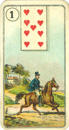
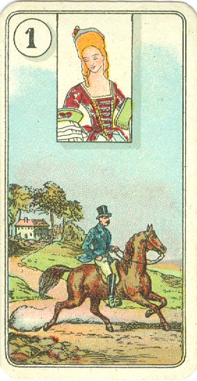
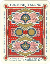
Before emphasizing the differences, we'll start with some features that are similar in each of the decks. The first common feature is that all decks are printed in chromolithography. |
||
 |
The second one is the shadow -as a tromp
l'oeil- of
the circles and cards to pretend that they are detached from the image. |
|
|
***************** But of course there are differences too. These differences are caused by the fact that the Carreras cards have a different size than the original Dondorf cards. To print the Carreras cards in lithography a new set of stones had to be made and this means that the scene had to be redrawn to fit the size. Because the almost square Carreras cards don't have the
height of the original, the design had to shrink. ***************** |
 |
|
|
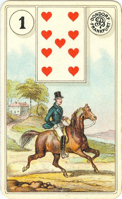
Dondorf #3 |
|
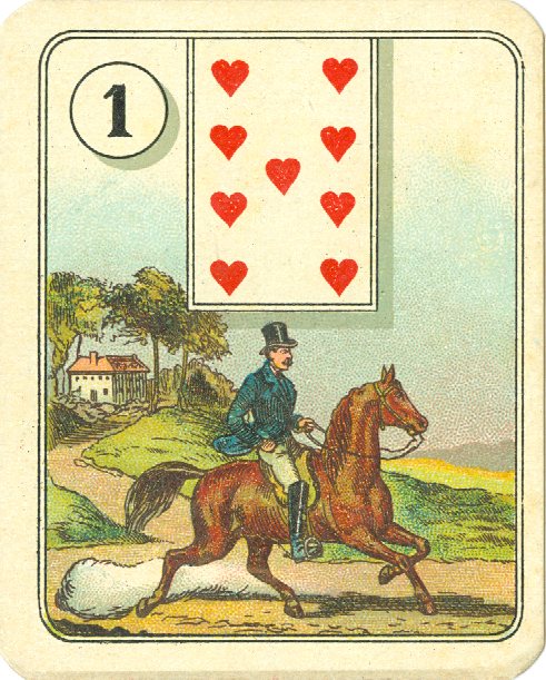
Carreras #1 |