-THE FRENCH & THE
SEA-
-4-
On this page we'll show you 4 cards of each deck and 3 references that we found. The first one (and in fact the one that triggered this xpo) is from the Cartorama catalogue 33 by Jean Darquenne. The second one is from the Fournier catalogue I. The third is from Han Janssen's book De Speelkaart.
Each picture in the reference is accompanied by the same card from our two decks.
Above:
the indicators are the same, the position of the bird against
that of the suitcolour is the same.
Below:
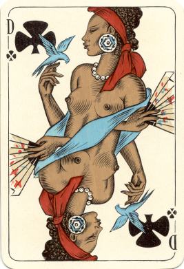
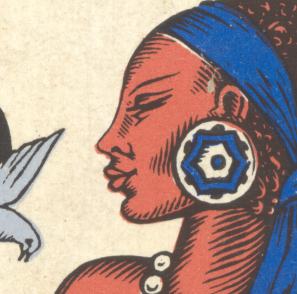
the fan is decorated, but not
exactly the same.
Same for the design of the earring: close, but not exact.
Jean Darquenne from Cartorama gives the only reference that contains information about the printing technique. He describes it as "offset". His description of the back design mentions a sailing ship and the cards measure 88 x 57 mm. He refers to Fournier 415 (see here below).
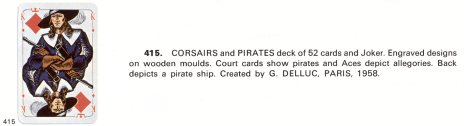
The Fournier catalogue describes the printing technique as "engraved designs on wooden moulds", attributes the deck to G. Delluc and doesn't mention Philibert. Backdesign is a pirate ship.
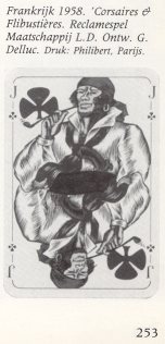
Han Janssen mentions that the deck was designed by G. Delluc and was printed by Philibert. He doesn't describe the back design, but says that the deck is an advertising deck for the L.D. Company, so it's probably not a standard -non-advertising- back design, like the "sailing ship" or the "fishes".
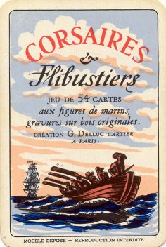
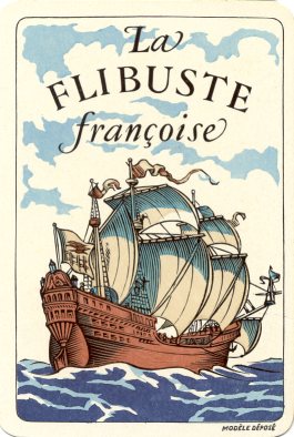
Then there are the title cards. The differ like day and night and most important...the title is completely different. The first one mentions that the "Corsaires & Flibustiers" is a deck of 54 cards, with figures of seamen, original wood engravings. Created by G. Delluc, cardmaker in Paris. The second just mentions the title "La Flibuste Françoise".
There are a number of differences between the descriptions in the references and the decks that we have here.
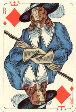
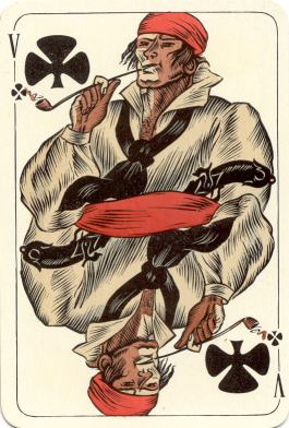
Although our first deck (page 3)
bears great resemblance to the decks from the references, there are a number of
differences between these decks:
1/ The measurements of the cards. Cartorama mentions 88 x 57.
Our deck measures 91 x 61.
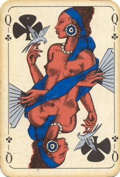
2/ Although the pictures in the Cartorama catalogue are in
black and white, there is a significant difference between the Queens of Clubs.
The dark blue ribbon in our first deck would look much darker in b&w and
there are no embellishments on the fan, that she's holding. Funny thing is, that
these embellishments do appear on our second "mystery" deck.
3/ The printing technique. Just like I trust Jean
with a measuring-rod, I trust his judgment of printing techniques. He notes this as
"offset". Here below a high resolution scan of a detail of a card from
our decks. Both are definitely not printed in offset, but look more like the
wood engravings (and coloring) that are mentioned on the title card of the
"Corsaires & Flibustiers" deck.
detail Queen of Clubs (deck page
3)
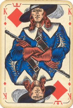
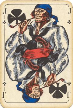
detail King of Clubs (deck page 5)
We don't have the deck with the "sailing ship" on
the back, so there's no actual comparison to be made here. As soon as we have
one, we can see for ourselves what printing technique has been used. However, if
it is really a Philibert deck, I cannot imagine it to be wood printed,
and Jean Darquenne will probably be right to have rated it as "offset".
Philibert has always opted to supply a reasonably large market and has usually
published decks in large numbers. Offset was the only way to do that relatively
cheap in the 1950's.
4/ The Fournier catalogue's description of the printing
technique would fit our deck, although there seems to be a little darker blue
used. But the description of the back design doesn't fit our deck and no fair
comparison can be made without knowing the measurements of the Fournier deck.
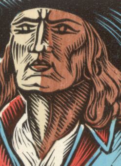
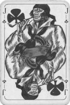
5/ Han Janssen's picture shows that there are some differences in
colors, although the picture is in b&w, the red should convert to a lighter gray.
I've converted our Jack to gray-tones and here's the result................
 to compare
There's obviously a
change in colors: probably a red headband and a dark blue waistband.
CONCLUSION
Based on the printing technique and the color-differences
between the described Philibert decks and our deck, we believe to have a G. Delluc deck, although there's a difference in
back design, compared to the
deck in the Fournier collection.
We hope that some of our visitors may
be able to give us conclusive information for this assumption.
Our "mystery deck" can be seen in full on the next page. This deck is not printed in offset either, but seems to be woodprint (black coloring) too. Any information about the deck, that any of our visitors can give, would be more than welcome.
-0- -1- -2-
-3- -5-
-6- -7- -8-
-9-
-10- -11- -12- -13-
-14-
XPOHOME