 4
4
4
PATIENCE No. 17
(second edition, ca. 1910-1915, J. Müller & Cie.; size 41 by 59 mm.)
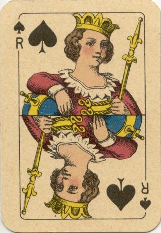
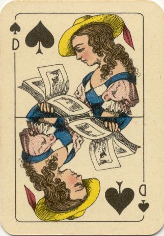
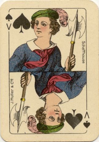
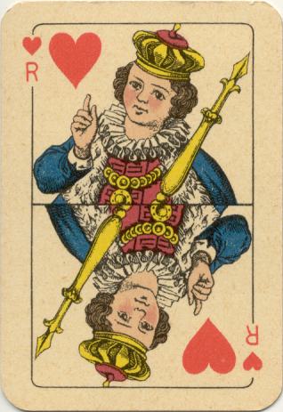
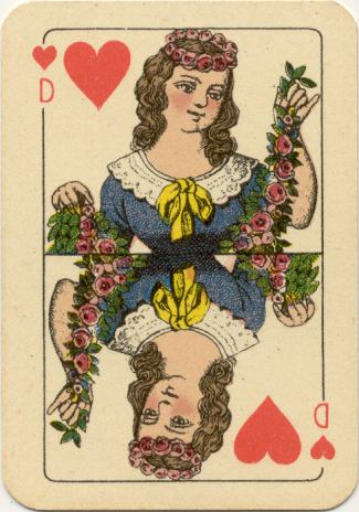
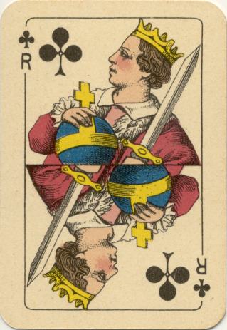
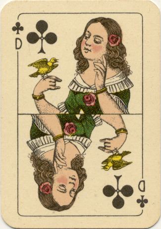
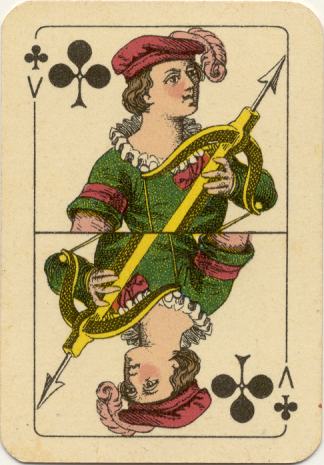
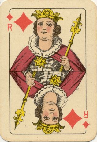
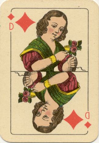
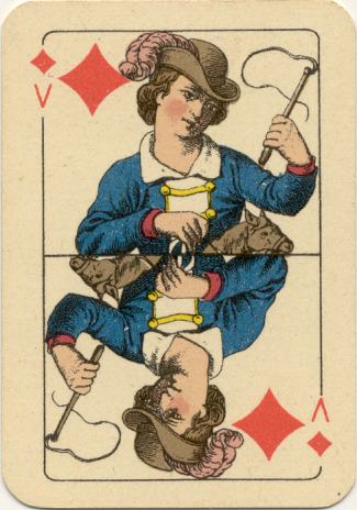
There are a number of differences between the first and the second edition. Although the designs on the courts were kept in the same suit and value and their colour-scheme identical, the most distinctive difference is that indices and a small suit sign were added.
|
|
|
|
|
|
The outline around the design had square corners in the first edition, but here they are rounded. Another distinctive difference is the maker's name. In the original deck it is mentioned on the Jack of Clubs, here on the Jack of Spades. Also the type font was changed and the words have capitals and lowercase letters.
|
|
|
|
|
|
|
|
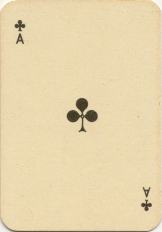
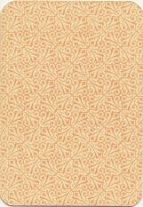
Plain Ace(s) and back design
|
|
|
|
|
|
Have we discussed all the differences? No, there's another feature that should be mentioned here too, if you haven't already noticed it: the children in the second edition look much healthier than in the original deck. Why? They all have a blush on their cheeks now!
And there's one difference that can't be seen on these images: the corners of the cards have been gilded.
|