INDIGENOUS
SCENIC ACES
"SMALL DUTCH PRINTERS"
Beside the Speelkaartenfabriek
Nederland there was no other large manufacturer of playing cards in the
Netherlands in the 20th century. Smaller printing companies have however
occasionally published a deck of cards. The quality of their products varies.
Usually they were issued as an advertising deck for a Dutch company and in most
decks the aces are "scenic": there’s a picture -drawn or photographic- on
the aces. The examples shown here below do not include decks with aces that have
pictures of products or company buildings. Although the latter might have
qualified as "scenic" in the sense of this article, we’ll only show
one example of them here below.
Because most advertising decks that were imported from Belgium had a standard
pattern, these small Dutch printing firms often used a non-standard design on
the courts.
Our collection of decks by small
Dutch printers is not complete, but there are only a few decks with scenic aces
in the sense of this article, that we cannot show here.
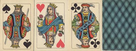
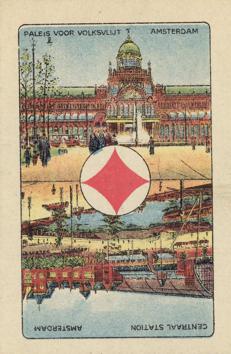
To begin, a deck of which the manufacturer is unknown, but which was probably
made in the Netherlands around 1920. Prof. Van den Doel of the Tax Museum
classified it as such in his catalogue of the museum's playing card collection.
|
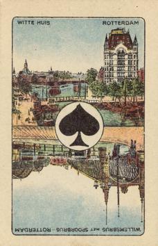
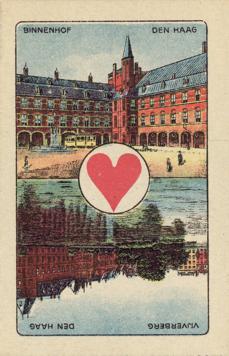
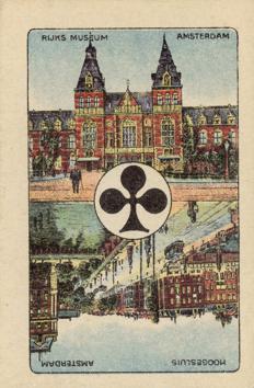
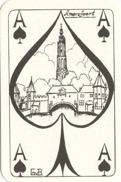
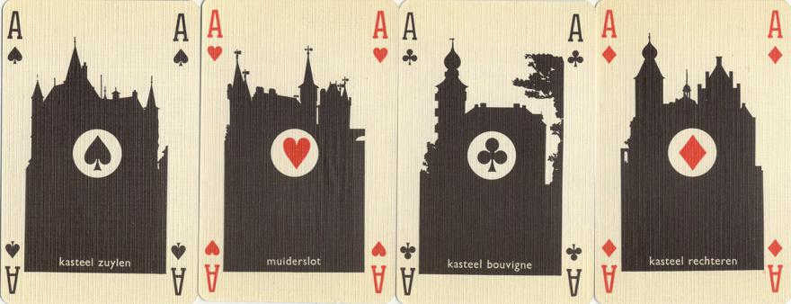
This deck was
printed by Drukkerij Juten from Bergen op Zoom and published in 1969 by
"De Kloof", a company, that produces matchbox labels.
The deck was designed by Walter Hagenaars.
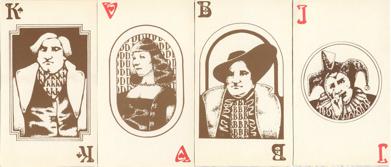
The courts show a fantasy pattern, the aces show silhouettes of Dutch
castles in a single image. The backside of the cards was designed in a
way that the same advertising as on matchboxes could be used on the
backs of the cards.
|
 |
 |
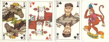 |
The deck has no
official title, but is known as
the "Aesculaap" deck, named after the company that published
the deck. It was printed by Drukkerij Van Roessel B.V. from Amsterdam in
1976.
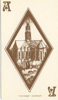
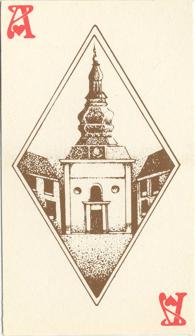
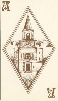
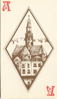
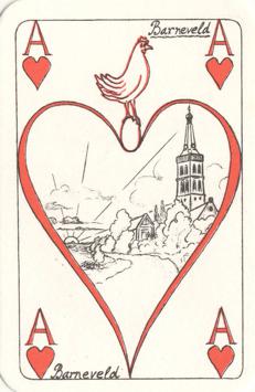
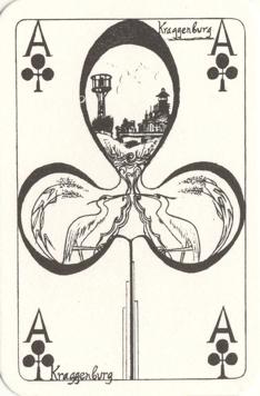
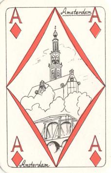
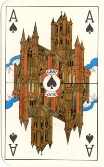
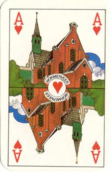
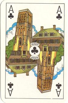
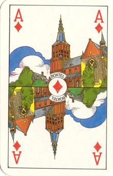
The
aces show churches from 4 different towns. Three are Dutch towns, but
for some reason the Belgian city of Gent was also included in this set. |
|
|
|
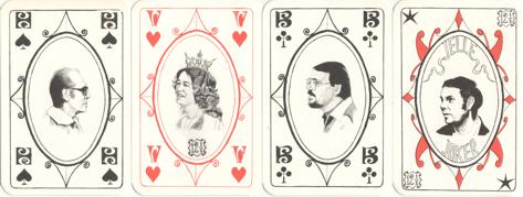
A later edition of the deck was printed in Belgium by
Carta Mundi. It has the same set of aces, but the cows on the Queens have
been replaced by farm girls. |
previous or
next