TYPE C (4rd edition)

|
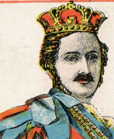
After the disappointment of the offset printing, it probably is the founding of the Kimberley Press Ltd in 1898 that has lead to the completely redesigned courts and different printing technique. Adding photoengraving of the portraits to colour lithographic printing made production cheaper, but also added to the credibility of the portraits. They are more truthful and easier to recognize. |
|
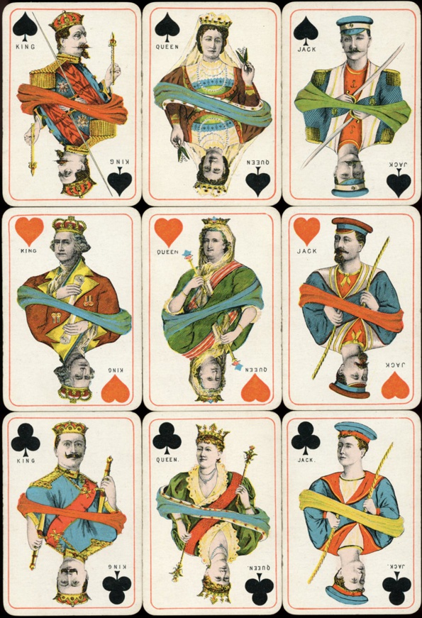
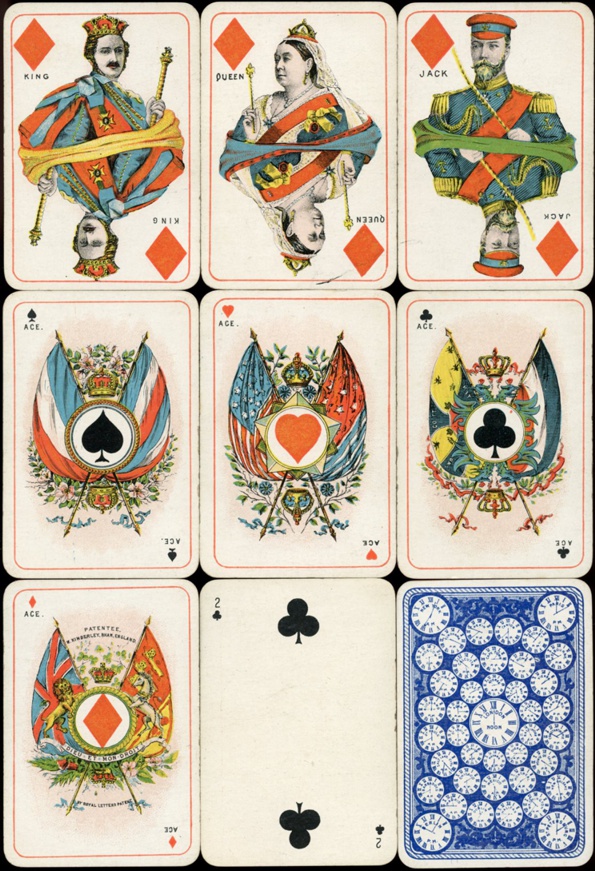
The kings, queens, jacks and aces are still spelled in full, but printed in black. Three of the jacks now show historical figures too. Only the jack of hearts still represents a typical US navy man. All the aces have been redesigned too. They only show two flags now, which serve as background for a stand carrying the suit sign. Please see the extra "characters" card that accompanied the deck for all the presented historical figures. The red outline has been kept. On the pip cards small numbers and suits are printed. |
|
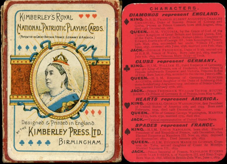
The info is printed on a red card, with a plain red back. So it was printed separately and added to the deck of 52 cards. On the front of the box there's a card with the title of the deck and a portrait of queen Victoria. It also mentions the Kimberley Press Ltd as designer and printer. The designs were probably done by William Kimberley and the printing lead by James Patrick. |
