|
|
|
|
|
 |
 |
||
 |
 |
 |
 |
 |
 |
||
 |
 |
 |
 |
 |
 |
||
 |
 |
 |
 |
 |
 |
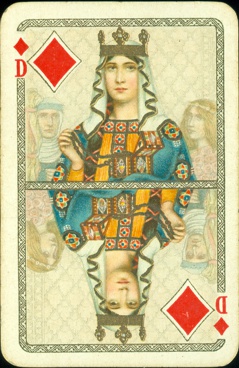
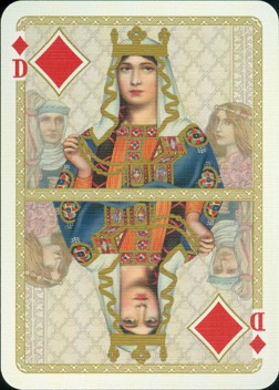
DONDORF vs LOTREK
After long
consideration I had decided to buy the double deck by Lotrek, his edition of the
100 Jahr Karte by Dondorf (# 005/250).
I had seen some of the cards before on FB and had read several articles about
this publication. I had already expressed my concern about this use of gold
directly to Lotrek during the design stage, when he showed an enlarged picture
of the queen of diamonds on FB. And the articles, mainly the one by Paul Bostock
in the CTD, about his deck had raised some eyebrows here.
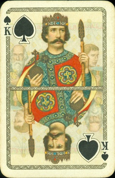
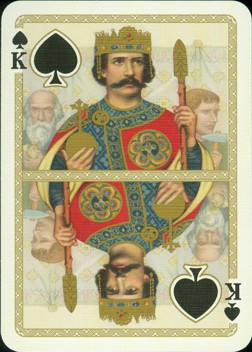
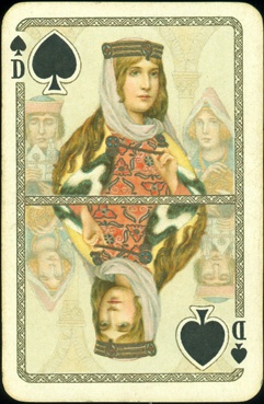
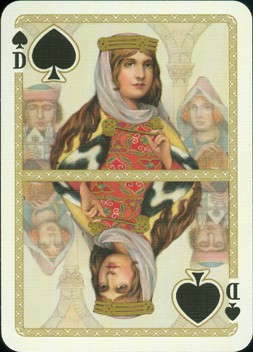
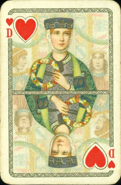
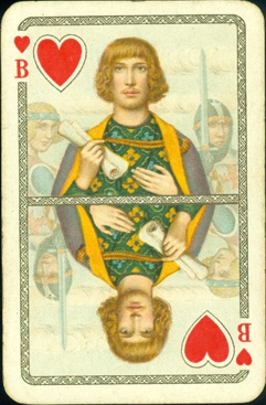
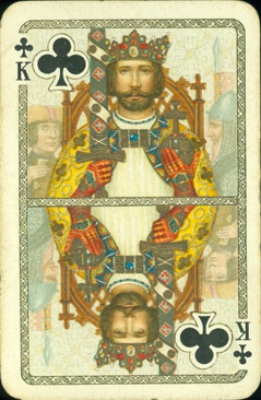
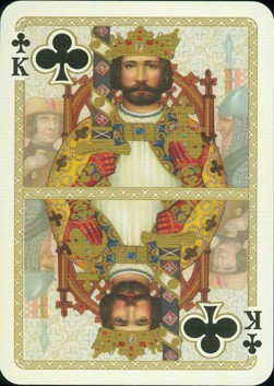
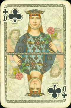
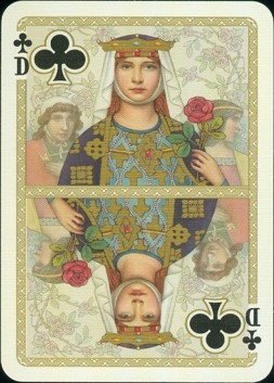
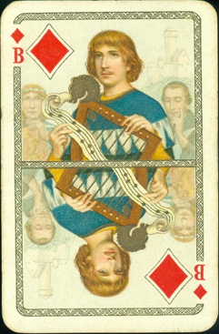
We now have the original Dondorf deck. Although it has been used and the cards are a
bit soiled, it could still be used to compare the original with the Lotrek
version. So we made scans of both decks and we'll start with an overall
comparison, before going into a more detailed comparison.
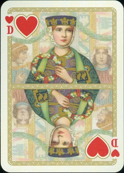
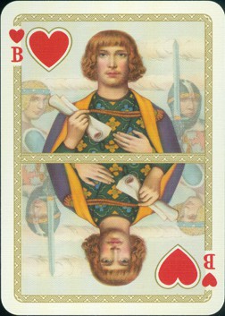
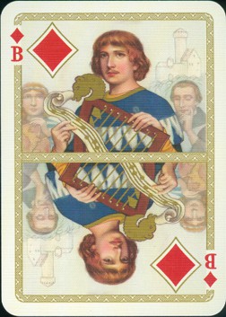
The Lotrek double box has a copy of the
original title application on the top lid. Only 250 double decks were made in a
numbered edition. The double deck is numbered on the bottom of
the box, our box has number 005/250. One deck has a yellow background. The
other deck has a green background, but besides that this deck has gold edges. It was
still sealed in our set, so we kept it that way and used cards from the yellow
deck to compare them with the original cards.
The double deck is accompanied by a
leaflet, with the original German text that had accompanied the Dondorf edition
and the English translation of it on the other side. There’s also a small
printed piece of solid paper, a sort of colophon, that reads: “Restoration of
the 1933 original authorized by Spielkartenfabrik Altenburg GmbH Designed by
Lotrek Printed by Cartamundi SA, Belgium”.
Restoration, a word of which Paul Bostock (CTD, Vol XXXII Nr. 2) feels that it seems “carefully and appropriately chosen. It is not intended as a facsimile but as a digital upgrade.” , but which I still in the first place interpret as returning something to it’s original condition. With damaged printed matter that's very well possible, but here the printed matter was reproduced, digitally redrawn. So in my opinion using the word “restoration” here is a bit overdone. A reproduction or facsimile of an antique deck is not uncommon and some are very well done. But it can't be called a reproduction either, because Lotrek tempers with the proportions. The "narrow" size design has been converted to a "wide" size card. But let's leave the semantics for now and scroll down slowly to see what the overall impression is and if there are details that catch the eye.
|
|
|
|
|
|
|
||
|
|
|
|
|
|
||
|
|
|
|
|
|
||
|
|
|
|
|
|
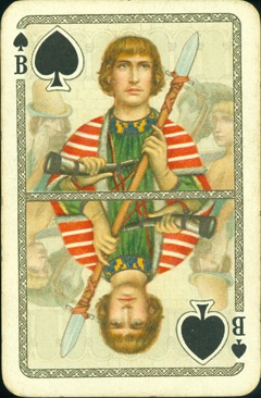
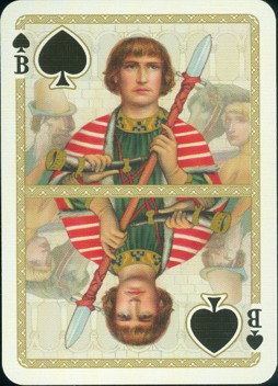
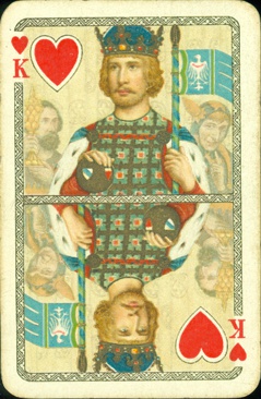
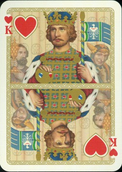
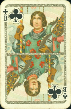
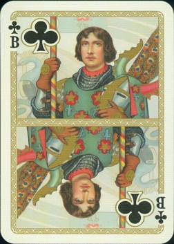
When you change the dimensions of the cards, as here by switching from narrow to wide model, it will have consequences for the design. Because the chosen model is wider and less high, the design had to be stretched to the sides and cropped in height. In this respect I was puzzled by the fact that the dividing line had been made thicker than on the original cards. This way it leaves even less room in height for the design. Result: the complete figure has become stockier than the original. It shows in the faces as well. In the new deck the courts seem to be better nourished. There's a little bit more flesh on their cheeks and their faces are more square than oval. Of course the distortion of the dimensions also affects the background design.
Digitally recreating such a deck
takes a lot of skill and even more persistence. I admire the effort and time
that Lotrek has spend on this project. My remarks and critical notes are in no
way intended to diminish his work.
It’s just that I favor chromolithography as a printing technique and like to
take closer looks at details. So when a digital version is published I like to
see how close it will be to the original. The Rijksmuseum in Amsterdam published
a facsimile of the Java Cards by Dondorf years ago. It was digitally printed
and came so close to the original, that -even with a magnifying glass- it could
only be recognized by the (modern) quality of the used card. So on the next page
we'll take a magnifying glass to both Dondorf 100 Year decks.