June
2016
 |
The
month started with the annual meeting of playing card collectors in
Turnhout (BE) at the National Playing Card Museum. Too bad that Miriam
wasn't well enough to attend, but it was nice to see the Belgian, French
and other Dutch collectors again. A week later there was a much smaller
meeting of Dutch and Belgian collectors in Kerkdriel (NL). These
meetings were the main sources of some new decks for our collection. We
didn't have much time to follow the different Ebay sites and the Dutch
auction site didn't offer any interesting decks. |
 |
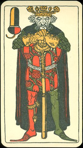
Turnhout brought
us -among others- two beautiful illustrated Russian decks and a special Belgian
deck from a very limited edition (40 copies), but when Joop spotted a deck there
that had been on our wish-list for a long time he couldn't resist buying it,
although it didn't come cheap. And although the month was only 6 days old, he
also immediately knew that this deck would probably make it to this spot and it
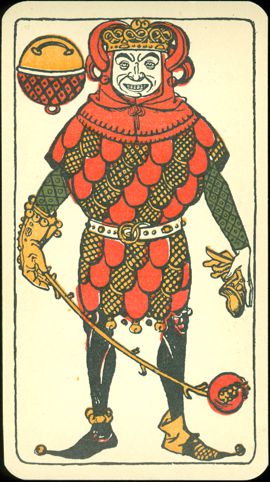
did. It's one of those decks, of which we are proud to be able to present it
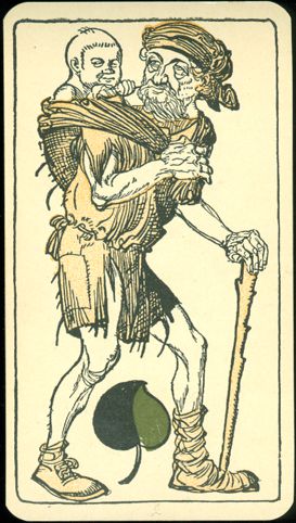
here. Great designs on the courts and rather unusual small illustrations on the
pip cards. Some of the latter remind us of details in the work of Hieronimus
Bosch, a Dutch painter from the 15th century.
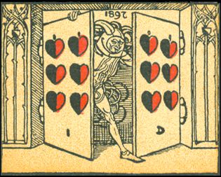
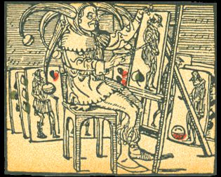
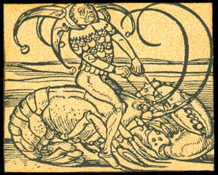
Some of these
small illustrations show the initials of the artist or a reference to this deck.
Here above details of the 9 of Hearts and the 10 of Acorns. On the first card
the year (of designing) and the artists initials are to be found. On the 10 of
Acorns we see the artist at work (his initials are on the bottom of the card).
In both cases he has depicted himself as a jester. This jester figure can be
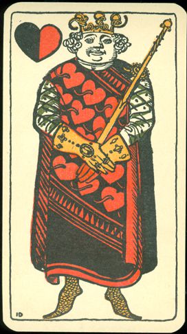
found in 3 other small illustrations too. The initials I.D. (Iulius -for Julius-
Diez) can be found on the King of Hearts and also on the 6 of Acorns. There are
a lot of interesting cards in this deck and we advise you to look at them all.
ENJOY!
In Munich Georg Hirth (together with Fritz von
Ostini) founded and
published a magazine called "Jugend" (Youth) in 1896. It was a weekly,
illustrated publication with the subtitle "Münchner illustrierte
Wochenschrift für Kunst und Leben" (Munich illustrated weekly magazine for Art and Life).
The artwork in the magazine was impressive and apparently quite influential, as the title "Jugend" became the name giver for the art style known
as "Jugendstil" (Jugend-style), which was a German pendant of the Art
Nouveau style,
which became popular throughout western Europe in the first quarter of the 20th century.
The playing card designs were first published as a page sheet in the "Jugend" magazine.
The cards were
first published as a complete 36 cards deck in 1898; the designs were done in 1897.
 |
The deck
was designed by Julius Diez, a German artist who was active in etching,
drawing, painting and graphic design. He was born in Nürnberg in 1870
and died in Munich in 1957.
He studied art in Munich, first at the Kunstgewerbeschule and then at
the Art Academy. He would later become a professor at both institutes,
in 1908 at the Kunstgewerbeschule and since 1925 at the Art Academy, of
which he became the second president.
He was one
of the main illustrators of the Jugend magazine, but also did
illustrative work for the Simplicissimus magazine. In 1904 he
participated in the first exhibition of the German Artists Association.
He has illustrated books and advertisements, but is best known for his
designs for the mosaics in the Hannover townhall. |
The deck was
printed in chromolithography by the Vereinigte Stralsunder Spielkartenfabriken, Abt. Halle. Abt. is
short for the German "Abteilung", which can be translated as branch or
division.
The regular VSS logo is stamped on the 7 of Bells, but there's another stamped logo on
the 6 of Hearts, which refers to the branch in the city of Halle.
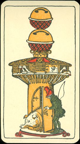
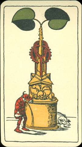
CLICK ANY OF THE
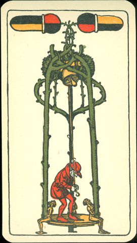
ACES (here DAUS) TO SEE ALL THE PIP CARDS.
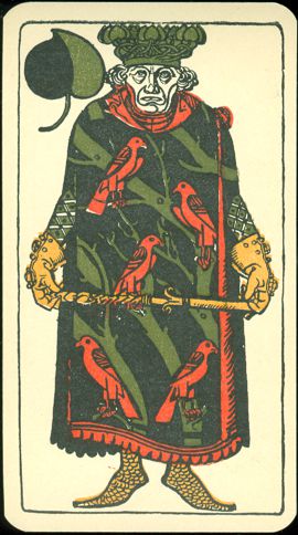
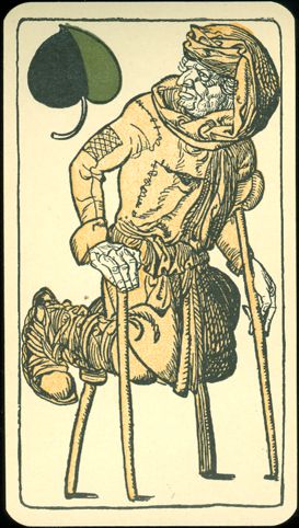
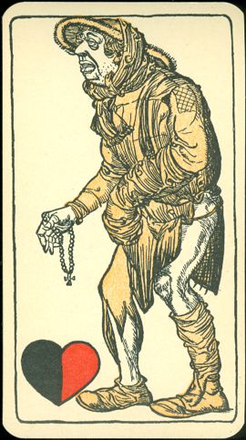
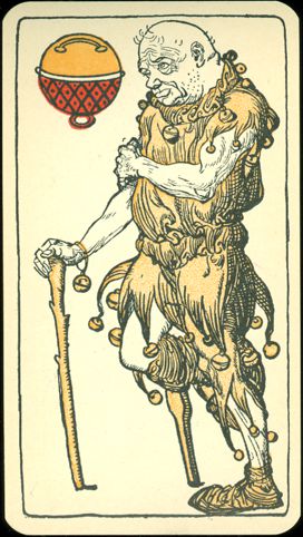
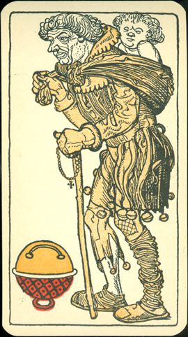
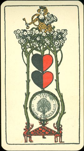
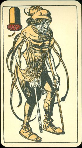
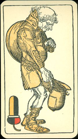
Of the court
cards the Kings are easily recognizable. Not just by their crown, but only they are
done in 3 colors.
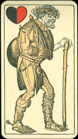
The Obers and Unders are done in a single tone. They have been described as
figures from the 30-year war (1618-1648).
The deck consists
of 36 cards. They are somewhat larger in size than regular playing cards and
measure 66 by 120 mm.
The wrapper and the back
design........ |
There's
a nice typographic novelty to be found on the wrapper and back. In
German Munich is written as München, with a so-called
"umlaut" on the u. Usually the umlaut is written as 2 dots
above the letter. But if an old-fashioned typewriter is used or if
you have forgotten the Alt+129 combination on your keyboard, it's not
possible to do that and an e is added after the letter. So it will be
written as Muenchen. However, on the wrapper and back that e isn't placed
after the u, but a very small e is placed at the top of the u (here
consequently written as a v). Although not the official way, it's
immediately clear was is meant and it makes a nice combination of both ways of
writing.
|
BACK
TO PRESENT MONTH