June 2015
 |
Somehow this month didn't bring us many
new decks for our
collection and it all started so well at the annual Collectors Day of
the National Playing Card Museum in Turnhout on the 6th. We attended, but
as we were on our way home from a week in England, we didn't bring any
of our trading decks to the meeting. We came home with about 10 decks,
so Miriam didn't have to spend more than a day to process them.
The next Sunday there was a Dutch collectors meeting at Kerkdriel, but
unfortunately there were not that many dealers nor visitors. We only got
2 new decks. The American Ebay didn't bring any decks at all. Not
because there were no interesting decks, but nowadays a lot of sellers
use that special Ebay shipping program and we refuse to pay the
outrageous shipping costs and import duties that Ebay imposes. So we
visit other Ebay sites, like the French, British or German one, and we
help funding artistic decks at Kickstarter. All this has led to an
interesting short list again this month.
|
|
Worth mentioning
are the latest "Delicious" deck by Emmanuel Jose, the beautifully drawn,
Russian "Ermita" deck by Olga Popugaeva & Dmitry Nepomniashchy and the MAD deck by Ozmer Olçer. But we went
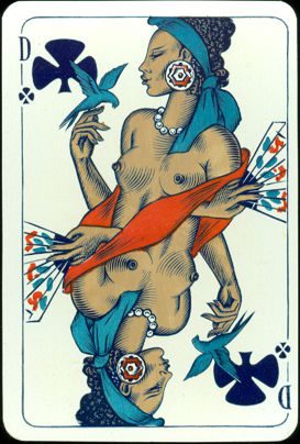
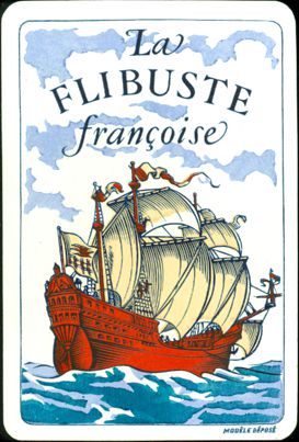
for a variation again this month, this time of a hardly seen deck. Above are the
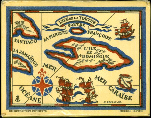
heads of the King of Clubs from the "La Flibuste
Françoise" deck by Gaston Delluc. The first one is from the 1952 edition, as
we've shown in the "French & the Sea" xpo (see page
5 there), but we can only make an educated guess to date the deck of the
second head.
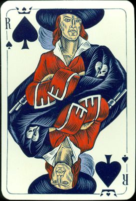 |
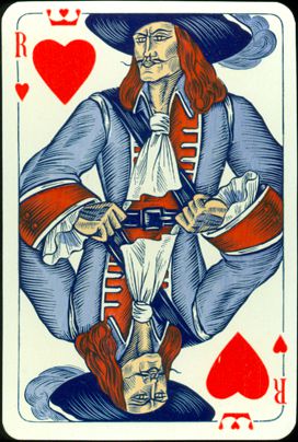
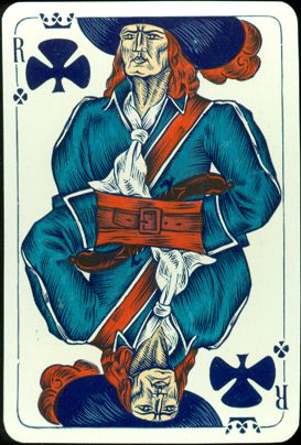
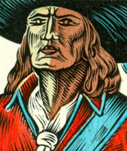
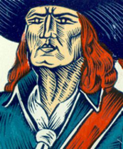
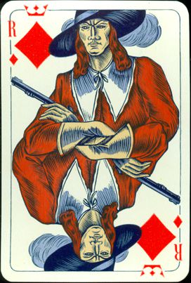
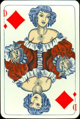
The
differences between the two editions are clear. In this version there
are 7 different colors to be dis- tinguished. The version from 1952 has
one color more and at the same time that is the color that makes the
difference. It's the brown as application for hair and.... shadow on the
faces.
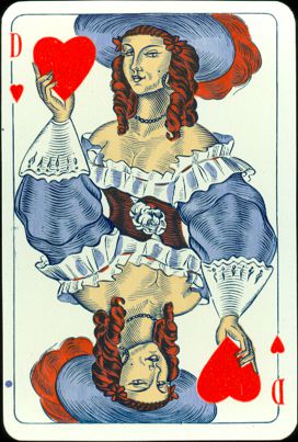
However, that was only applied on the Kings and Jacks. Maybe it was done
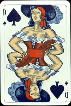
to emphasize their female looks, but on none of the Queen's faces
the brownish shadowing was applied. |
|
The use of
shadow makes the faces much stronger and outspoken.
When
compared it's clear that the use of red and blue has been reversed. On
one of the cards this has led to an unusual and unrealistic combination
of color and object. See the hair and the little fox on the Queen of
Diamonds. But the limited use of the colors has also led to a
distinguishing feature: the black suit symbols are printed in dark blue
too. Black isn't used at all in this version. |
|
But when
compared, the enlarged heads above also show minute differences in the design.
If you take one design and have two engravings made of that design, there will
always be small differences, as engraving is done by hand and it's almost
impossible for an engraver to make an exact copy. There will always be lines
that are done just a little different. However, the existence of these small differences would
mean that for this version a different set of woodblocks has been engraved.
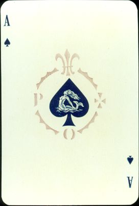
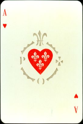
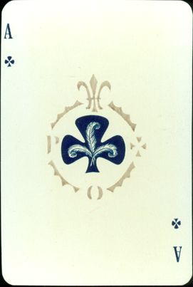
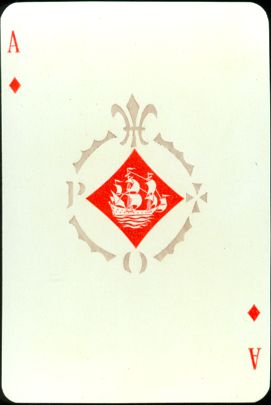
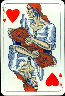
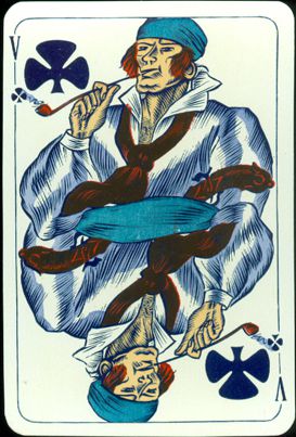
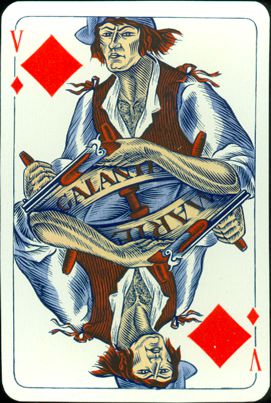
The aces have
embellished suit symbols: a mermaid, French lilies, (presumably) the feathers
on a pirates hat and a ship.
The letters P and O have caused some confusion. They are also on the aces of
the decks from the later edition, which is usually attributed to Philibert, and these are often mistakenly
offered as an
advertising deck for the P&O (ferry) line. On top there's the French lily
again, but we cannot explain the cross-like symbol and letters either.
It's easy to distinguish the Delluc deck from the later Philibert decks. The
Delluc cards have gold corners and are somewhat larger than usual. They measure
68 x 101 mm.
 |
The
shadowed deck was created by Gaston Delluc. It was engraved by Henri
Renaud after the original designs by Sylvestre Guy. The coloring
was reproduced in stencil by Edmond Vairel and the deck was printed by
D. Viglino. There's no reason to think that this lineup was any
different in the creation of this deck. So we're left with the
question which deck came first. The deck here is probably not a trial
version, as it has been finished with shiny gold corners,
just like the |
|
shadowed
deck. Still, we believe that this deck here is the first version. The
color scheme is simpler and the coloring of the designs leaves the
faces of the courts rather bleak, as if they stayed in their cabins
during the whole journey. In the shadowed deck these shadows allow the
bleak parts to suggest a highlighted area by the sun, while the
shadowed part suggests a more suntanned complexion. See the brown hand
of the King of Hearts. This simple improvement puts the men back on
deck. |
 |
With the
evident exception of the Queen of Clubs the faces and hands of the queens were
left as they were. Apparently those ladies were allowed to stay below. So....
a date? It's probably safe to assume that this version was the first one and,
although we don't know how many copies were published in this edition and
therefore cannot estimate the time it took to sell them, we tend to date this
deck at c1950. It's even possible that the decks were sold simultaneously for
a while.
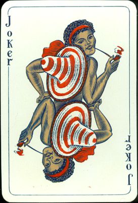
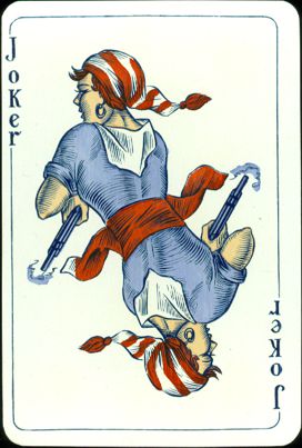
The colored rings
and stripes on the jokers straw hat and bandana were later changed into a single
color:
yellow for the hat and brown for the bandana.
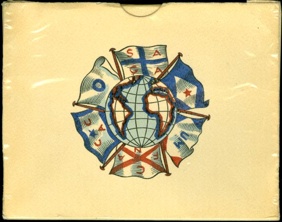
This deck came
without a box. However, in the "French & the Sea" xpo we only
showed the accompanying information/gift card.
So now it's a good opportunity
to show the double box, in which the two shadowed decks came.
BACK TO PRESENT MONTH