May 2014
 |
It wasn't
our best month regarding playing cards. Joop wanted to attend the
opening of the new exhibition at the National Playing Card Museum in
Turnhout, Belgium. The exhibition was about the Great War (WW I) on
playing cards and the "vernissage" started at 8 PM. The drive
usually takes close to 2 hours, so Joop left the house at 5 PM. However,
a truck had caused a massive accident just south of Amsterdam and at
6:30 he was glad to get out of the traffic jam at a nearby exit, still a
little north of the accident, turn around and head back for home. Oh
well, he'll get a second chance to see the exhibition during the
Collector's Day at the museum on June 14. Hopefully Miriam will be able
to come along then too.
The weather had its moments this month and we had to get some work done
in the garden. Buying new plants and planting them took up a lot of our
spare time. Although she still has off-days, Miriam is slowly improving
and we can see or entertain friends more often. So we didn't follow the
complete offer on Ebay nor that of the Dutch auction site and Joop
visited only two local flea markets. No catches at the flea markets and
outbid on most of the interesting auctions, so the offer to choose from
this month was limited, in quantity as well as quality. |
 |
|
It has led
to a rather poor short list, with only one (1) antique deck and a
limited number of modern ones, of which the best one couldn't be shown
here. It's the latest "Pagan" deck by Peter Dunham and Linnea
Gits from the Uusi Studio. However, we don't show decks twice on our
site. Because it is part of a series of 6 decks and we already show 3 of
them in the ART&CARDS section, the Pagan deck can be seen there and
you'll have to settle with the second best here. |
Since a few
years we have been helping to fund projects with playing cards on Kickstarter, a
website where artistic, cultural and social projects are "crowd
funded". The above mentioned series by Uusi is one of "our"
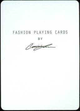
projects and the chosen deck for this month is another one. The deck was
conceived and realized by Connie Lim, a young designer with a love for fashion.
The deck took a while from subscribtion as a backer until production by the USPCC,
but it arrived this month.
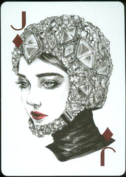
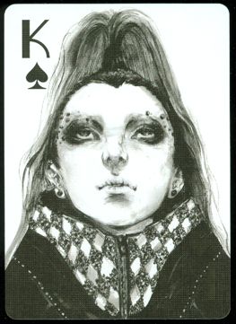
Connie Lim is a fashion illustrator and designer. She started illustrating back
in 2006 in the early days of her time at Art Center Pasadena, where she attended
a fashion illustration class. We'll let Connie tell us about the deck, but will
add some notes here and there too.
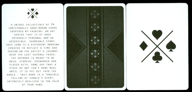
On Kickstarter
this deck was described as "54 Hand Drawn Card Illustrations Inspired by
Fashion" and Connie Lim explains: "my goal with this project is to
create a beautiful deck of cards that is at once intensely personal and an
accessible, shareable story. Each individual card is a different drawing that I
created reflecting a time and period on my journey. The artwork is meant to be
held, studied, exchanged and played with. Some say that a piece of art isn’t
made real until it is put out into the world -- this work is a tangible telling
of my story, intimately realized in the palm of your hand."
 |
|
|
|
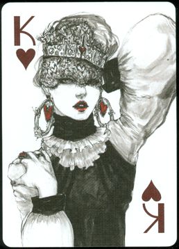
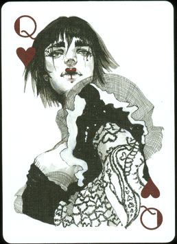
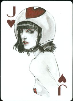
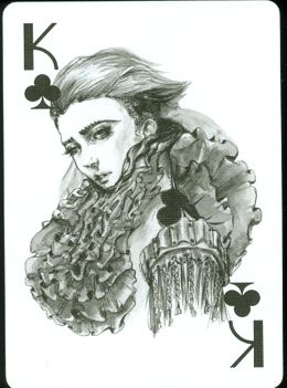
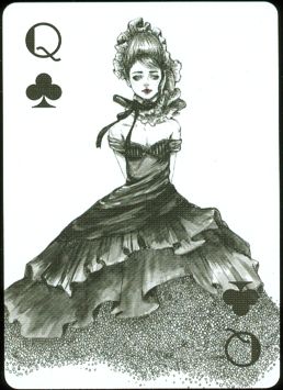
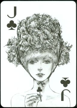
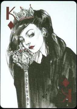
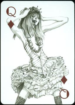
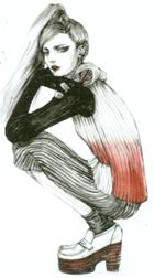
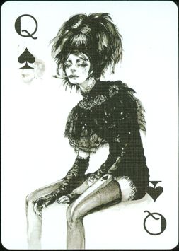
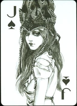
The deck gives the feeling of looking at a coffee
table book rather than a deck of cards. And that's what Connie had in
mind. |
"The deck
is primarily art-focused. Although functional, the cards are still mainly a
vehicle to convey the illustrations (apologies to all die-hard card collectors
and aficionados -- though I'm learning so much about your beautiful world). Each
illustration is based purely on my thoughts and feelings towards the suits and
numbers. They are a personal reflection of my journey at the time of
illustrating them, and I hope they can speak to you in some way as you are on
yours".
 |
|
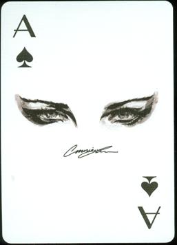
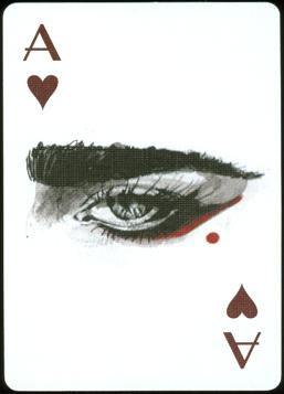
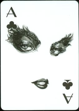
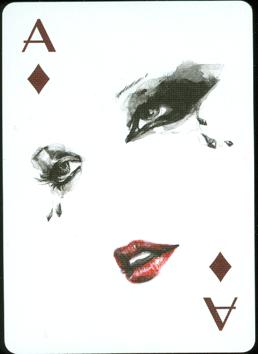
CLICK THE ACES.......
|
|
TO SEE THE PIPS PER SUIT
|
|
|
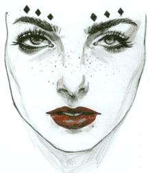
Functionality
requires fast recognition by players and there are a few features that slow that
down. Now that you've had a chance to see the pip cards, you'll also have seen
that some cards are not that functional, as the number almost disappears in the
design. Also the chosen color for the red suit signs and pips is rather dark. In
real it's
closer to black than on these scans and it requires taking a better look at the shape.
The use of dark red is also a
bit odd, as the red details in the drawings in those suits are printed in a
brighter red.
A final word
from Connie:
"I am fascinated by fashion, and it was through the class that I
started my Fashion Playing Cards project. In working on the series, I found an
outlet to both express and evoke emotions through my drawings, which had up to
then seemed little more than the sum of individual lines on a page. The impact
of that realization meant the project never left the back of my mind, even as my
studies and then freelance work took me away from completing what I had started.
But having stepped back from it and grown as an artist in the past few years,
completing the cards has become an apt parallel for my journey as an
illustrator: the changing drawings encapsulate how my technique and perspective
have evolved. Unfinished drawings ask to be finished. Similarly, I am drawn to
the need to finish this series, to conclude the chapter of my life it helped
launch so many years ago."
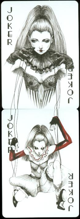 |
The jokers
were probably meant to form a diptych. The idea of one holding the strings
and the other being the puppet is clever, but the calibrating of the
designs could have been done better.
The 2 extra
cards have 2 printed sides and cannot be used with the deck. They have
Connie's signature and info on one side and text and the design for the
special stamp on the other side. |
|
|

|
The deck was
published in a limited edition of 3500 and was supposed to come with a special
metal luxury box.
That box was delayed and backers received extra decks in regular tuck boxes as
compensation.
We're not sure if the special boxes were ever delivered, we haven't heard from
Connie since the publication.
BACK TO PRESENT MONTH