Analog &
Duolog
by
RUTH KEDAR
|
|
Ruth Kedar was born in Brazil, but moved to Israel in her
youth. After receiving a degree in Architecture there at Technion, the Israelian
Institute of Technology, she moved to the US for a Masters Program in Design at
the Stanford University. Her master thesis there was on playing cards design.
This brought her a commission by Adobe Systems to be one of the designers of the
Adobe deck. She remained at Stanford University as a Consultant Art Professor
from 1988 to 1999.
She has designed two award winning decks. The first one was printed by Carta Mundi from
Belgium and published as "Analog" in 1989 in an edition of 1000 red
and black decks. The second one is titled
"Duolog" and was printed by Colorgraphics from San Francisco, USA. This
deck was published in a limited and numbered edition of 200 copies only in 1996.
|
|
Ruth Kedar has received several design awards and her artwork
has been shown in the US and internationally, but she is probably best known for
designing the Google logo. She was one of the founders of Art.Net and her work
can be seen there in her online studio since 1994 in 4 portfolio's: digital art,
monotypes, mixed media and playing cards.
She's also a member of the 52+Joker
club of American playing card collectors and has designed the membership
list's covers in 1998 and 2000. |
But who can better
introduce her art than Ruth her self, as expressed in her Artist
Statement.........
"More than making single images, I develop logical structures that
create new visual progressions.
I work in many layers. My philosophy and aesthetics are the fibers that run
through them, connecting, expanding. The creative process, this dialog between
self and medium, evolves into visual languages-- their grammar ever changing
to encompass new avenues of thought.
Therefore, my medium of choice is always a vehicle of variation and
exploration. Currently I am working on several new art series, gestating a
book on patterns, and developing a new deck of transformation cards."
Ruth Kedar, September 1995
Analog
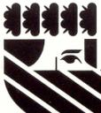
In the Analog deck only 2 colours are used: black for the
Clubs and Spades and red for the Diamonds and Hearts. The basics for the deck
are kept simple and efficient. The type font is slim and to the point.
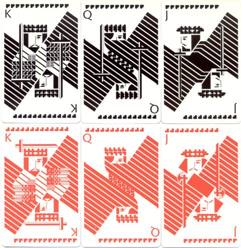
Suit symbols can be found
at the top of each card. On
the courts they are also integrated in the complete design. They either form the
crown or cap, or are set in a pattern against diagonal lines. Although all the
cards have indices, the
denomination or value of a card can be read in two other ways too. One can count the
number of suit symbols, that form a line at the top and bottom of the cards, but
one can also count the lines that are set diagonally in the design. On the
Aces there's only one diagonal line and one suit symbol, on the Kings there are 13 lines and
suit symbols. By placing these elements on the borders of the cards interesting
patterns appear when fanning the cards.
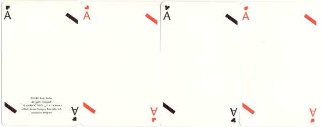
CLICK ON THE ACES TO SEE SOME NUMBERCARDS AND THE BOX.
What immediately catches the eye is that all the Queens seem to be "veiled"
and that all the courts are
one-eyed . The design of their
faces was brought back to basics: an eyebrow, an eye, a nose rim and a mustache.
Yet these are the only non-geometrical elements and in this way emphasize the
human element in the complete design, that is basicly formed by lines and geometrical
shapes and sequences. Even the hair and beards are reduced to triangular,
quadrangular or pentangular shapes. A female touch is given to the Queens' hair:
a curved side in the quadrangle.
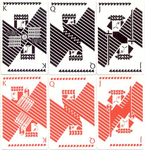
The one-eyed Jack of Spades, the one-eyed King of
Diamonds and the horizontal sword over the King of Hearts suggest that the
anglo-american pattern has inspired the artist. The attributes consist of swords
and axes, but they seem to have been divided randomly among the suits. The
Spades are best armed with 3 swords, although it's highly irregular to see the
Queen of Spades with one. The Clubs have to do with only one sword.
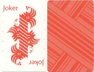
The joker has a
design with some frivolous, curved, elements. On all the other cards the broad
red or black lines indicate the card values. The joker has ten of them,
but -and this must be a coincidence- in this design these create 11 thin white
lines and here in the Netherlands 11 is often refered to as the fool's number.
Because of the use
of two colours only and the straight-on design, the analog deck highly suggests
functionality. How different is her second deck, which is shown on page
2............
-1- -2-
ARCHIVES
or ARTHOME