BLUE BLOOD vs REDUX
In English the expression may be different, but translated straight from Dutch our expression would be "progressive insight", with which we basically refer to a learning process and not being afraid to look back and make changes. Designing playing cards was a new discipline for Linnea and Peter and apparently it took three decks before they had reach the point of looking back. It probably helped that their first deck was on the brink of being sold out.
In their third deck they had developed the triptych as an answer to the boring extra cards that usually accompanied the USPCC decks. The triptych does have all the information about publisher/designer, printer and date, so still useful for collectors, but combined with a special design, spread out over the two cards. So for the Blue Blood Redux deck they immediately implemented this newly discovered idea.
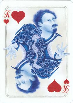
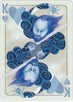
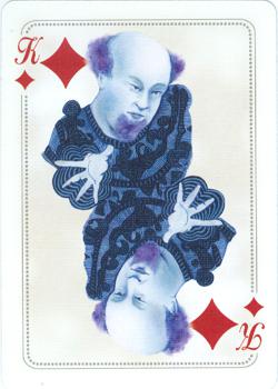
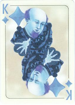
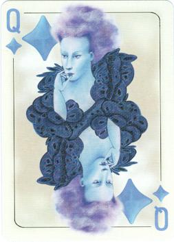
But it wasn't the only change that they have made. Where changes are made there's always a chance that there's a victim. In this case it was the King of Hearts who had to fall. The reason for this has been given on the Redux page. But there are more general differences to find. Not to miss are the change to a larger and more solid font and color of the suit signs. Less visible is the gray background on the courts. In the original Blue Blood deck it's pretty light and in the Redux deck it has been made slightly darker.
The result of the last two changes is that there's less contrast in the Redux courts, which makes the general look much softer on the eyes. In the Blue Blood deck the red tended to jump out. The double outline has been replaced by a single one. Not a line of dots anymore but an undivided line. This emphasizes the difference between the darker gray within the line and the color of the card.
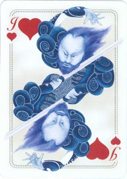
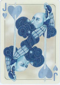
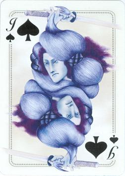
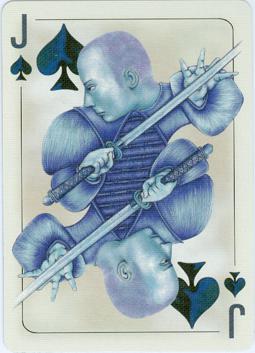
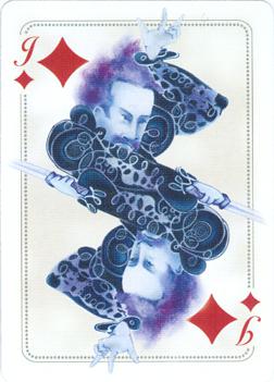
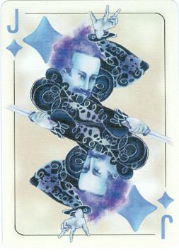
But there are some cards that were newly drawn, like the Jack of Hearts here above or the Jack of Spades here below. Probably not done on purpose, but both new jacks have a crew cut.
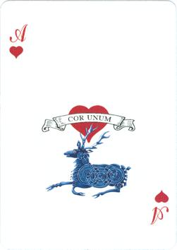
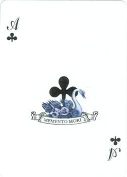
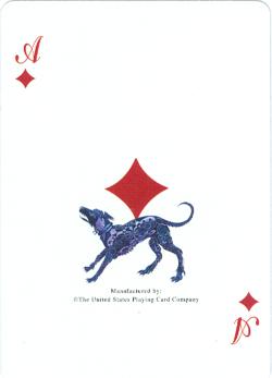
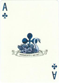
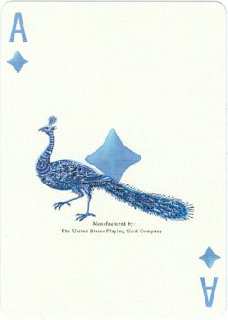
On the aces the red is banned too and, as said before, the light blue is just light enough to be recognized as different from the dark blue "black" suit signs. But as you can see that's not the only difference. On the ace of Hearts and that of Diamonds a different animal is introduced. We can only guess to the reasons for this. The common sensus about the Diamond suit is that it is related to commerce and money and the peacock is a much better animal than a scruffy dog to show how one can flaunt his wealth. In fact some centuries ago they were actually kept for this purpose by the upper class.
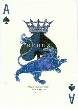
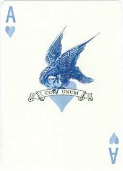
The change of the deer for a bird of prey is less understood here, but we like the fact that he's nibbling on the heart. A new title, so a new design for the large suit sign on the ace of Spades was necessary too.
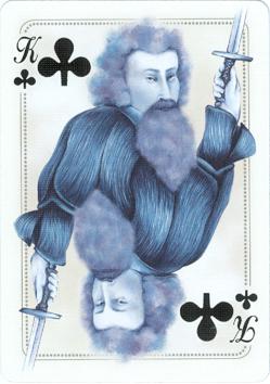
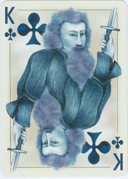
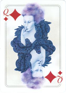
These were the most visible changes, but there are more subtle ones too. It seems that some details in the designs have been changed. Look at the face and beard of the King of Clubs. Or at the hand of the Jack of Diamonds: a little darker with more detail. Or the head of the Queen of Diamonds with more shadow and less oriental eyes. This last feature has been changed in some other characters too. In general most of the courtly figures have been enlarged just a tiny bit, which was possible because the double outline was replaced by a single one.
It's very well possible, that we've missed a few other subtle differences, but in general we can say that the Redux definitely is an improved version in design and shows the development of Linnea and Peter in their ideas about designing playing cards.
or
BLUE BLOOD (1)
BOHEMIA (2)
ROYAL OPTIK (3)
PAGAN (4)
or